More than an enterprise version “AppStore”
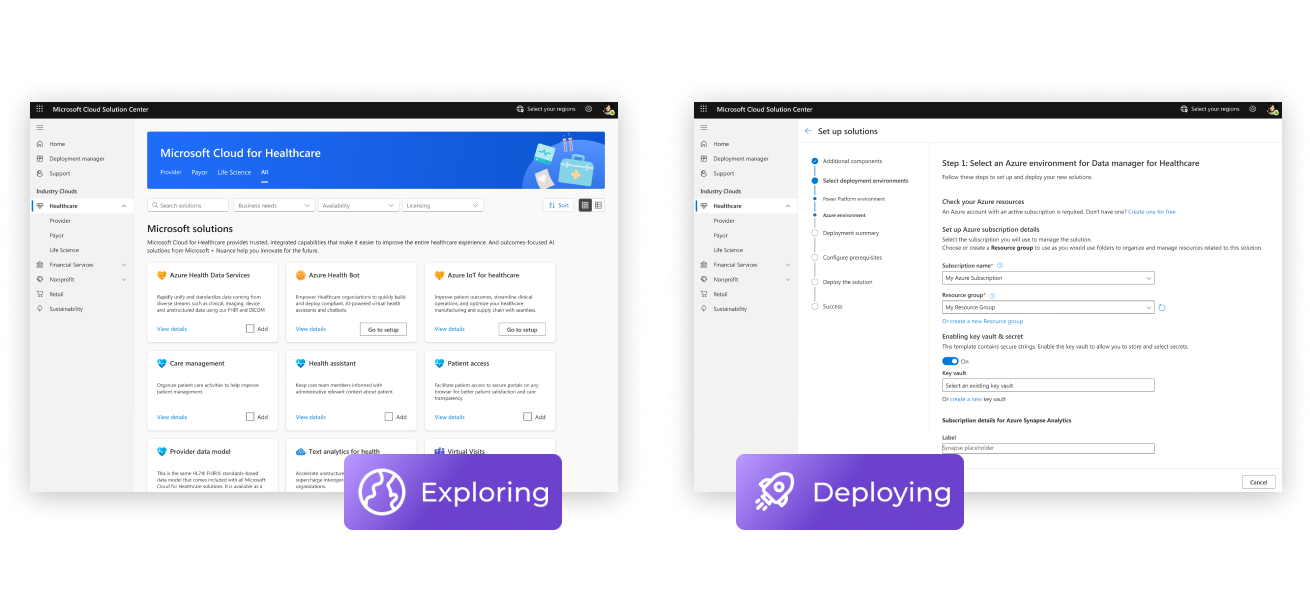
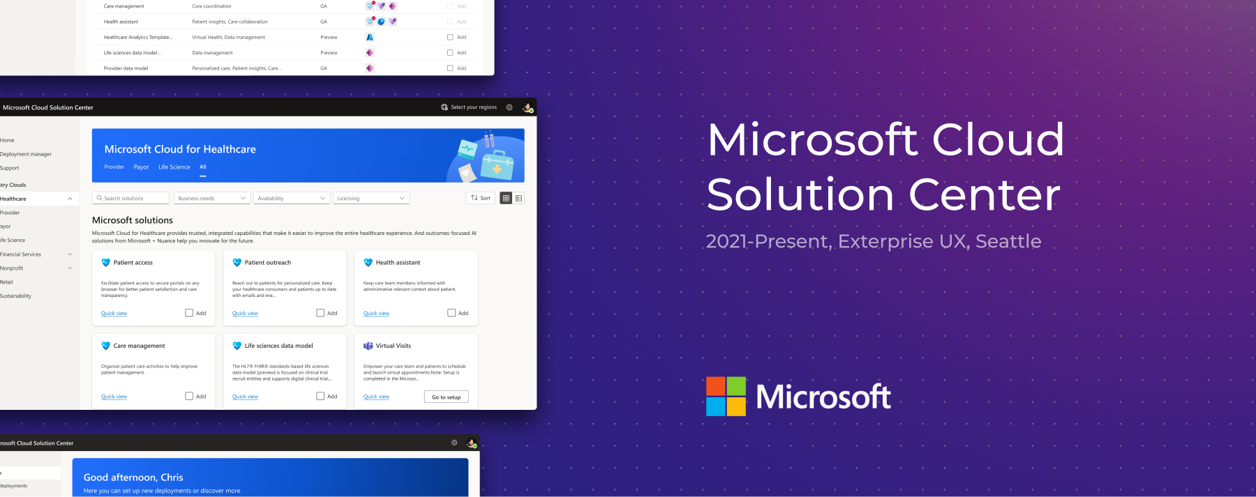
The mission of Microsoft Cloud Solution Center is to assist users in finding and deploying the industry cloud solutions that empower their organization.
By industry cloud solutions, we are referring to software including applications or building blocks that are utilized in certain industries to empower digital capabilities. For example, users can deploy healthcare solutions which simplify workflows to connect people and support teamwork.
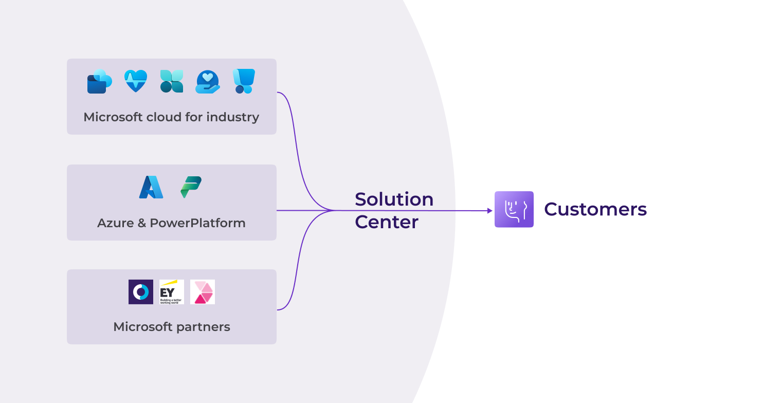
Nowadays the building blocks of industry solutions are hosted across different platforms, the north star for Solution Center is to act as a hub that covers as many as the solutions from Microsoft and its partners so that users can do all their works in one platform.
Highlights
My Mission
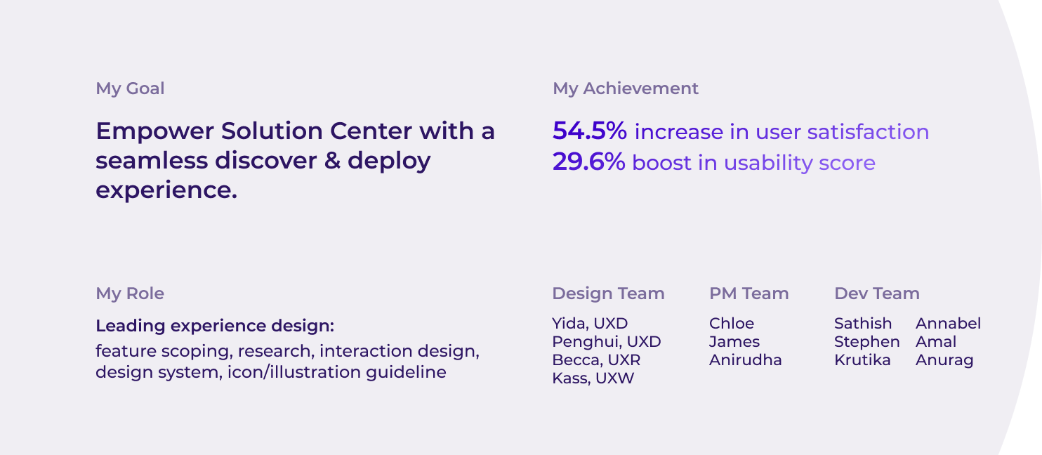
I joined the team at the moment when there was only my manager working on Solution Center. The previous designer had set up a solid foundation for the first version of Solution Center, but the whole team was focusing more on scaling the business, so they didn’t have a chance to well polish the user experience.
So I embarked on a treasure hunt in search of design files and requirements documents that would help me learn about Solution Center's history and future goals. And then started to take the baton and led the design for several upcoming new features and a long-awaited refreshment of the whole discovery experience.
Fortunately, we have you who understand all about Solution Center
Based on the common journey for a customer to find the appropriate solutions and the business planning from Microsoft’s perspective, user interactions with Solution Center mainly contains two part: Discovery and Deployment.
Discover Solutions
Users usually start interacting with Solution Center by exploring solutions, the mission here is to help different kinds of users narrow down the solutions based on their needs and to learn about their capabilities.

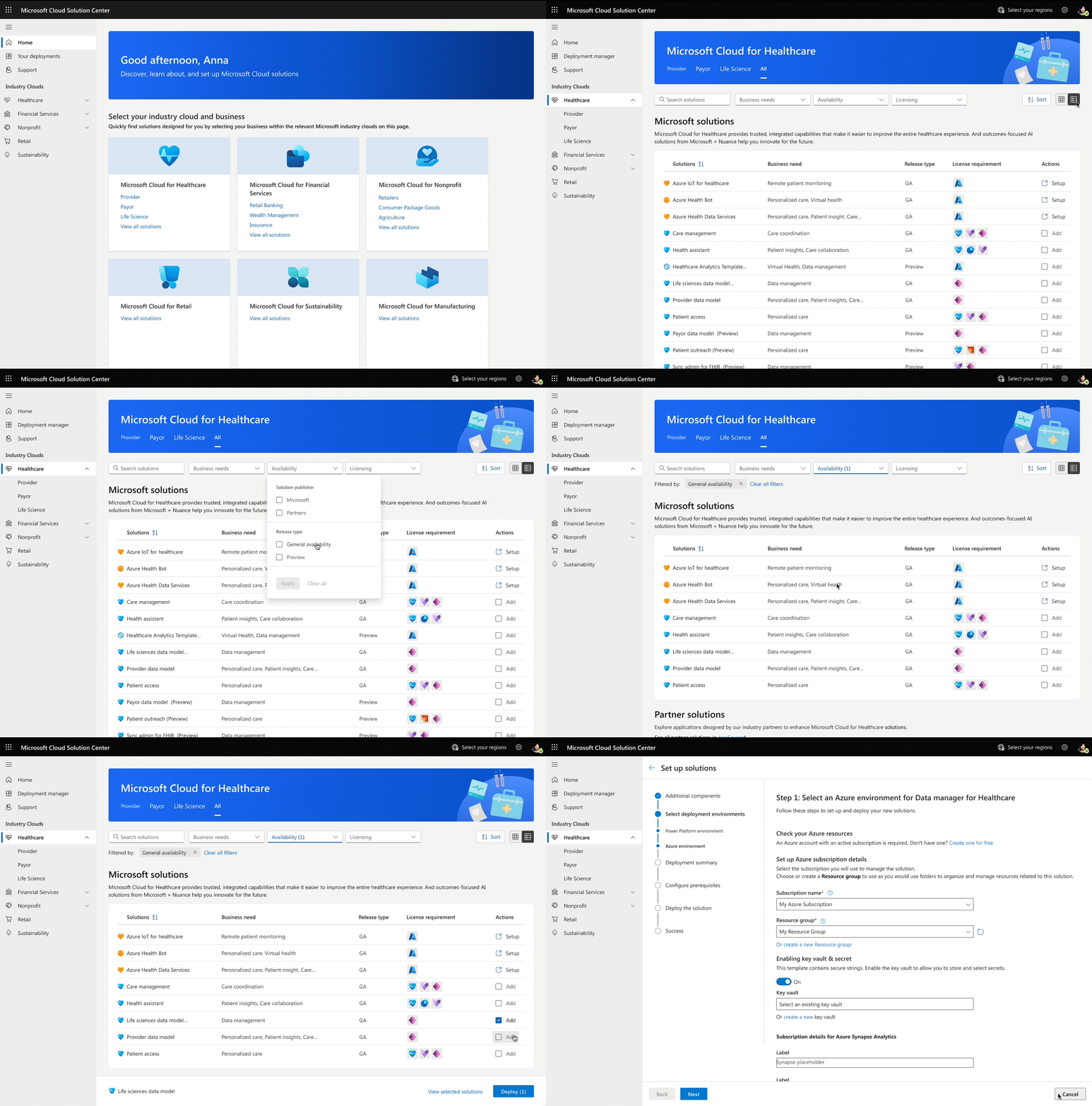
I worked on features that match the updates of the sales mode(e.g. solution preview, third-party solutions visibility), and in meantime redesign the whole discover experience from IA structure to features helping users narrow down solutions(e.g. filters and list view), and finally to the card system redesign and UI reskin. I also refreshed the local design system and worked with visual designers to create new illustrations along the way.
Deploy Solutions
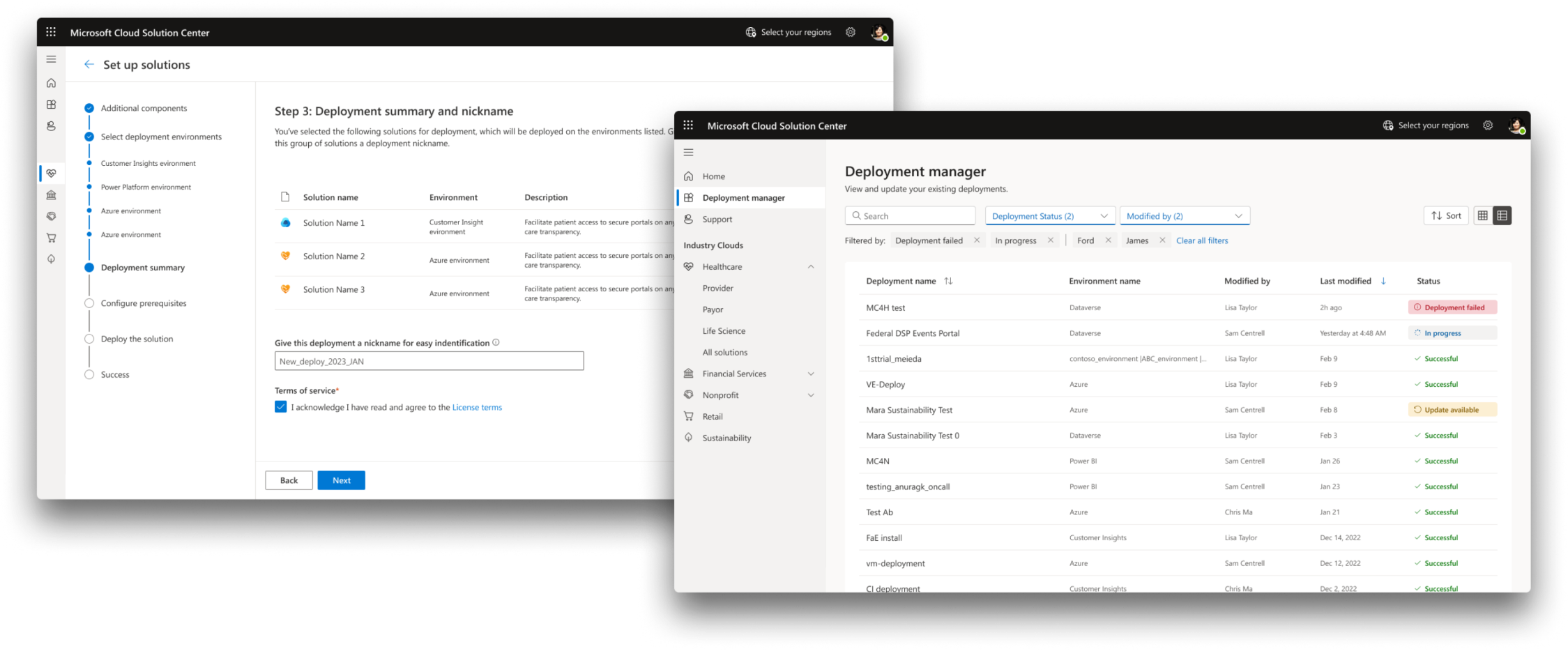
Users can deploy solutions into their data environment though Solution Center, this is a more complicated and technical user flow. I worked on some features that help orchestrate solutions and functions from other platforms(e.g. Power Platform environment creation, Azure multi-package deployments)
Outcomes
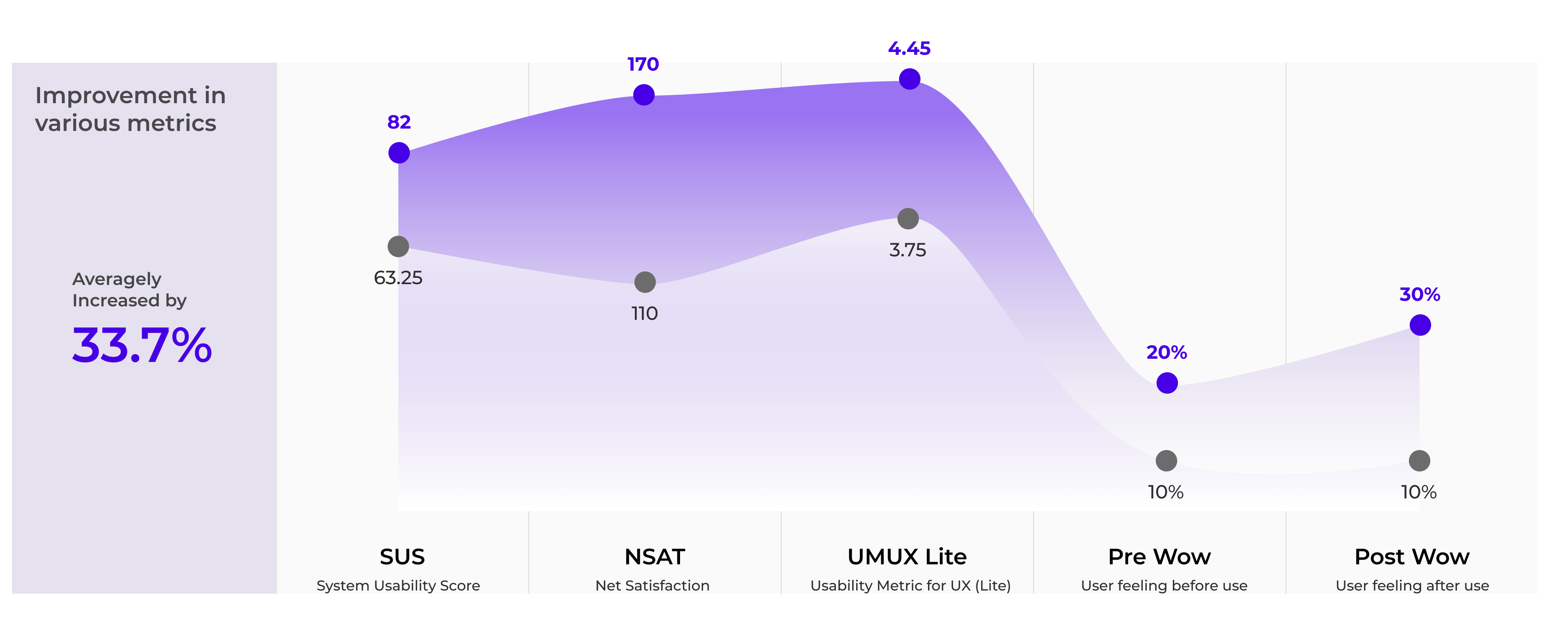
We conducted an UX benchmark study through recruiting 10 users to complete 20 tasks on Solution Center. 5 metrics are captured during the study, showing a great improvement compare to the same study we did last year. Resulting in a 54.5% increase in user satisfaction score and an 29.6% boost in usability score.
Build a better discover & deploy experience
Solution Center is a newly developed product. In the past years, the team was focusing more on scaling the business, the user experience is not well polished.
Users and their jouney brought unique challenge
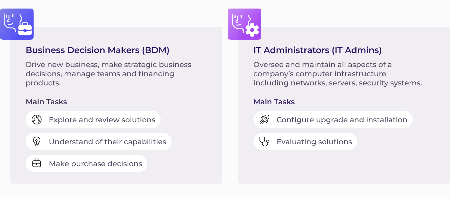
Business decision makers and IT administrators, our 2 types of personas are targeted as Solution Center’s audience. They collaborate in the same organization to decide which solutions they should purchase. Depends on the actual organization, each of these 2 personas may cover various jobs titles.
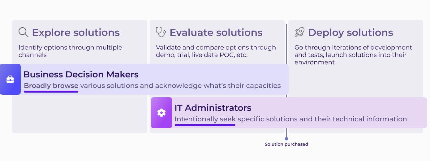
The journey in real world is more intricacy, and variate due to different organization. But let's make it simple, we can predigest the end to end journey for users to get a solution as Explore, Evaluate, Deploy. Due to the respective job to be done, the 2 personas' needs and expectation can be different. Solution Center should ensure both of their distinct experience are taken into account.
So, what's the old experience?

An UX benchmark study was conducted to measure the experience and to understand the problems of the old version. From a lack of functionality integration within the platform, unreasonable information architecture, inefficient interaction and visual design, to various usability flaws, a myriad of issues has been exposed. In summary, these have led to two challenges: Hard to find solutions and Hard to deploy solutions.


Hard to find solutions: Users have to go through the navigation level by level with outdated interface, read through the jargon that are not in their language, it's especially not helpful for IT admins to find exact solutions

Hard to deploy solutions: IT admins have to go back and forth between platforms, some key capacities are not implemented

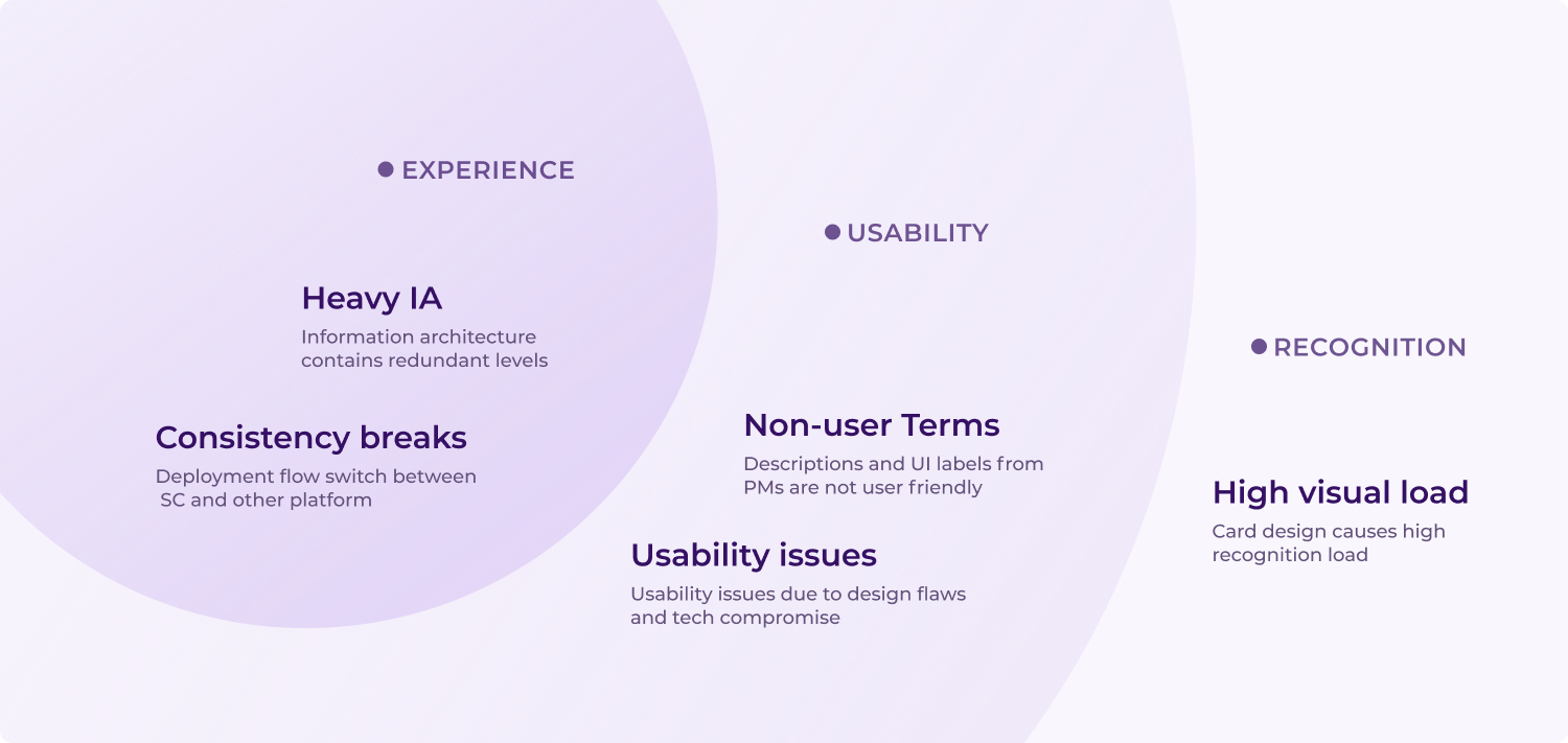
I classified the pain points by their level to help prioritizing and tracking.
Design process
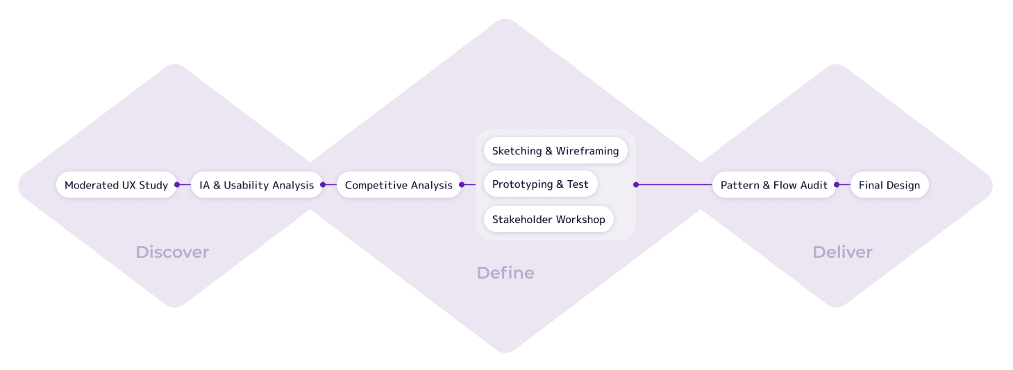
Although each design task is treated individually, I generally follow a process of discovery, definition, and delivery. A design task usually begins with discovering the problem through UX studies and internal analysis. Then, design directions are determined through brainstorming and competitive analysis. Design ideas are specifically practiced by sketching, wireframing, and iterating through prototyping and testing. Sometimes, I also hold stakeholder workshops with developers and PMs to collaborate on the design. Finally, since each feature or user flow is interconnected, I conduct a design patterns and user flows audit to track use cases in the solution center and ensure nothing is missed for each feature.
The exploration experience primarily involves guiding customers through a variety of solutions to help them find the one that best suits their business needs.
Information Architecture

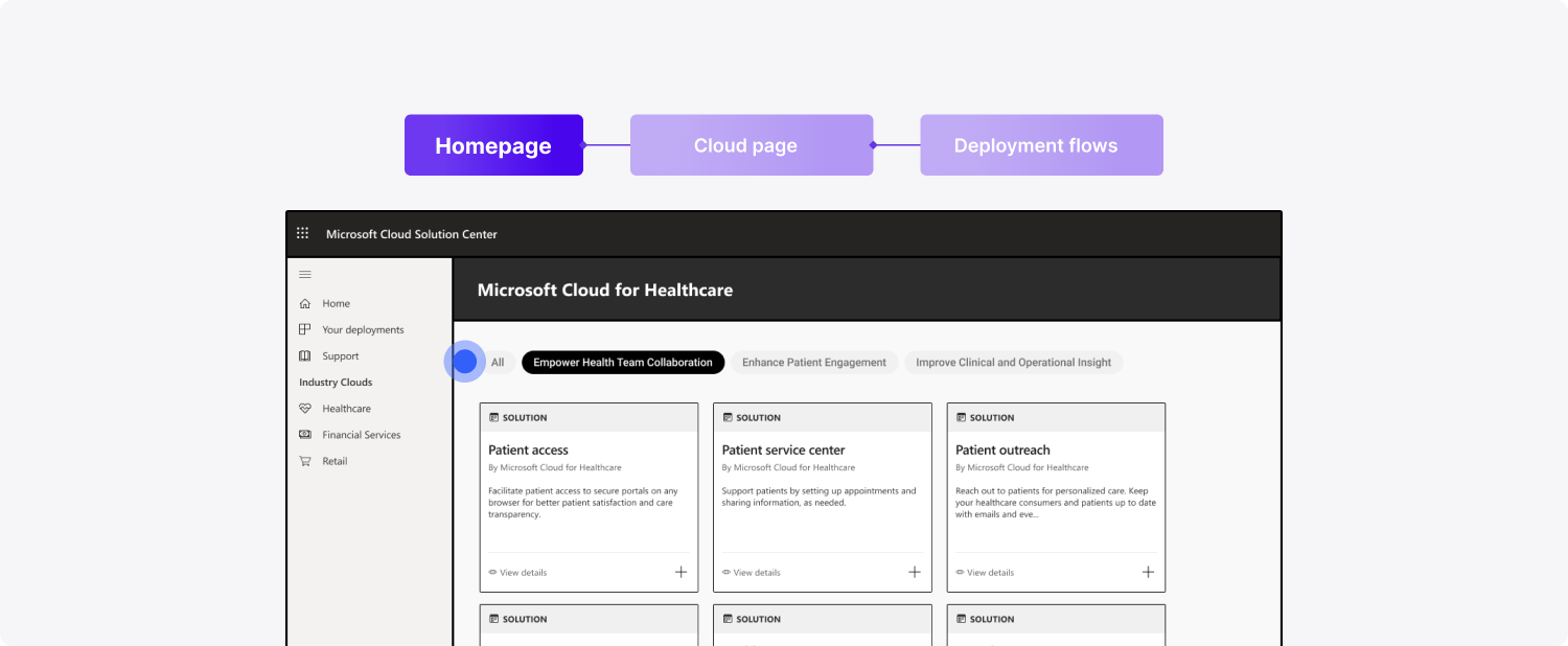
Problems start with the information architecture. While trying to explore the solutions, users navigate through the capability level and then land on the page for each industry cloud. The purpose of the capability level was to help users narrow down the solution listings by specific customer scenarios or use cases. However, this layer ultimately became a burdensome step according to user studies, as the information provided does not effectively help users predict what they will see in each capability. Additionally, this classification no longer matches people's mindsets. Instead of capabilities, users are now more familiar with verticals and actually expect to see item listings earlier.
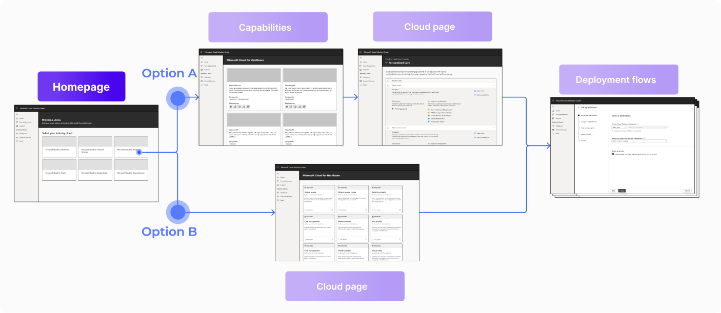
I came up with two main design directions. Option A is to refine the capability page to provide clearer information to help users select. Option B is to remove the capability page and create a more straightforward user flow. I ultimately decided to move forward with the second option, incorporating the capability level as a filter or navigation item on the cloud page.
Landing Experience

The concept of vertical leads to a change in how the landing experience is presented. To highlight the new classification method, I decided to show the entry points in each industry cloud entry card. Additionally, these entry points will navigate users as the top-level controls in each cloud detail page.
Solution Listing
After the capability level is removed, users now may see around 60 different solutions when they land on the cloud page, leading to the need for a more powerful way to narrow down solutions.

Option A: My choice is to redesign the card system, sorting out potential new metadata, and adding badges and headers accordingly to differentiate solutions effectively.
Option B: Creating solution clusters for solutions that usually deploy together or require the same licenses.
Option C: Base classification according to deployment capacity and provider.
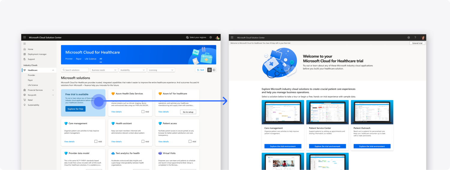
Finally, I moved forward with a blend of these options. I conducted a partial redesign for solution cards and utilized sections to classify solutions, differentiating their provider and license type.
Targeting Solutions
Enabling users to sort solutions based on their customized needs represents the final step in helping them access the solutions they desire. Previously, the solution center lacked filtering or searching features. Thus, I resolved to introduce features to address this gap.
Indeed, a basic and widely used filtering and searching system is necessary, as our users have been requesting it for quite some time. In addition to this, I devised something that could more effectively address the problem for IT admins.
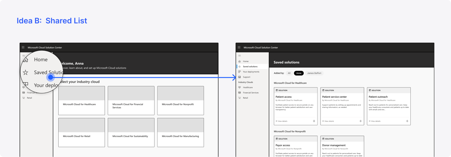
IT admins typically seek more specific and technical information compared to BDMs when interacting with the Solution Center. Additionally, rather than exploring ahead, IT admins often prefer solutions pre-selected by BDMs. Thus, I devised ideas to better assist them. Idea A involves adding a list view to display more information per screen. Idea B proposes a shared list between IT admins and BDMs, allowing IT admins to easily access solutions saved by BDMs instead of manually searching for them. However, due to constraints on our development team's bandwidth, we ultimately proceeded only with implementing the filtering and searching system and the list view.
Filter & List view
As filtering and searching represent common patterns in both enterprise and consumer experiences, I initiated a competitive analysis to discern current trends. I specifically targeted the two extremes for each dimension, aiding in my decision-making process regarding Solution Center's positioning.
The first trend pertains to the information exposure rate for controls. Some platforms opt to nest controls to maintain a clean interface, enabling users to focus more on the content. Others choose to present all features directly on the interface, catering to advanced users who prioritize efficiency.
Secondly, platforms have differing perspectives on layout. Some prefer to compress labels and controls together, while others opt to display them all separately.
I then established principles for the Solution Center. The filtering system should support both BDMs and IT admins, facilitating easy exploration and efficiency. Therefore, it should adhere to these rules:
Horizontal layout
Save horizontal space
Expose filter selections
Simple text match for V1
For the list view, considering that our competitors do not offer a deployment experience like Solution Center, they lack a truly compact list view. However, since Solution Center aims to assist IT admins, the list view should be as compact as possible. I consulted with PMs and internal experts to determine the information that would be most helpful for IT admins. Ultimately, we established these rules:
As compact as we can
Show licenses requirements to help IT admins
Card Redesign
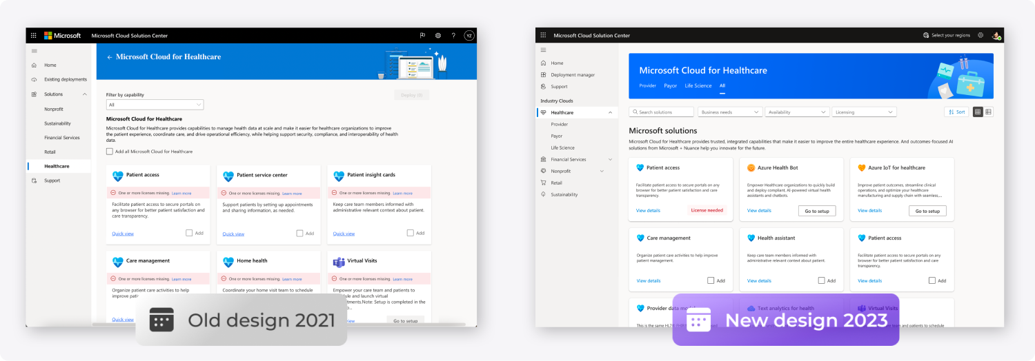
I also redesigned our card system to reduce the visual recognition load. The report from our user testing revealed that the old design made it difficult for users to scan information. After investigation, I identified that this difficulty was mainly caused by the card icon. Our organization lacks the visual design bandwidth to create unique icons for each solution, resulting in many solutions using the same icon. Moreover, the current icon size is too large, which highly distracts users. Additionally, the way we display warning messages exacerbates the design issues. Currently, we show warning messages with a message bar that occupies an entire line, drawing too much attention and consuming space unnecessarily. In response, I refined the size and spacing of each element. Now, I display warning messages on the add button, as users cannot add a solution when there's a warning.
Prototyping and test
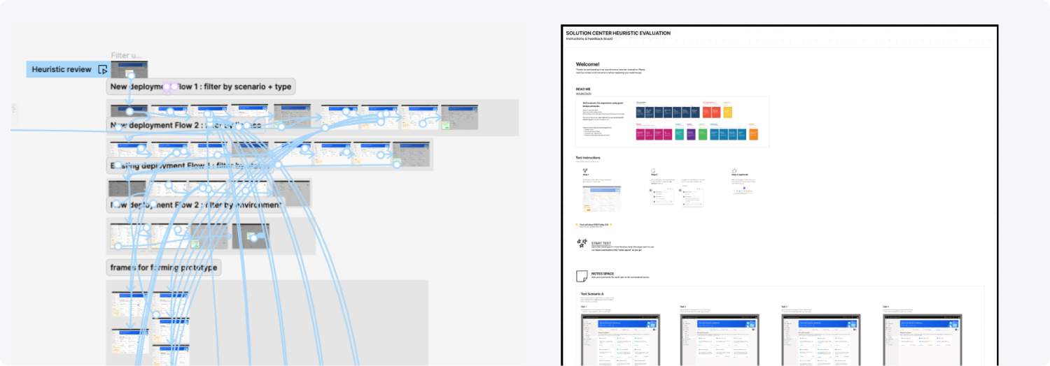
Everything is ready, and I need feedback from users. However, I was informed that we lack the budget to support user testing at the moment. Therefore, the UX researcher and I decided to conduct the testing internally. I created a prototype based on the test protocol we developed and also prepared a FigJam file to guide the test and allow participants to drop comments directly.
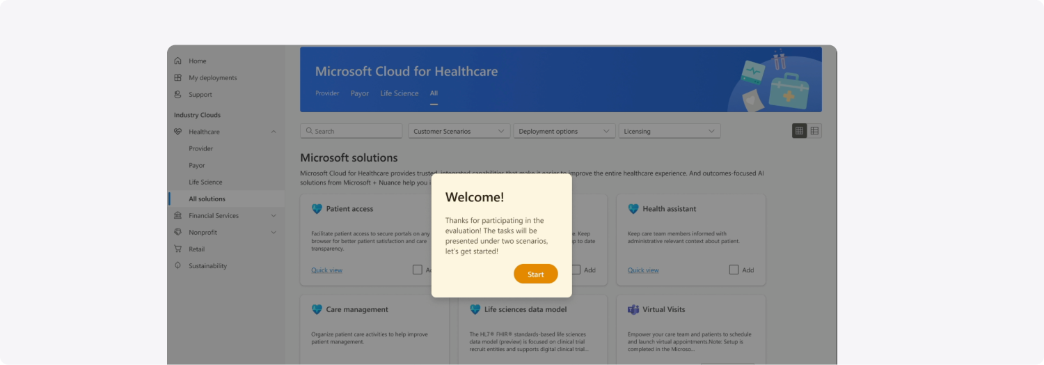
In the test prototype, my approach is to include guiding panels on each screen to assist users through the tasks. Based on my previous experience conducting unmoderated user testing, I observed that many users would become lost in the tasks. For example, some might be focused on task 3 but inadvertently navigate to task 5 within the prototype. Therefore, I decided to have fixed guiding panels in the prototype to help mitigate this issue. I collaborated with the UX researcher and the UX writer to ensure that we are not leading the users but rather providing helpful guidance.
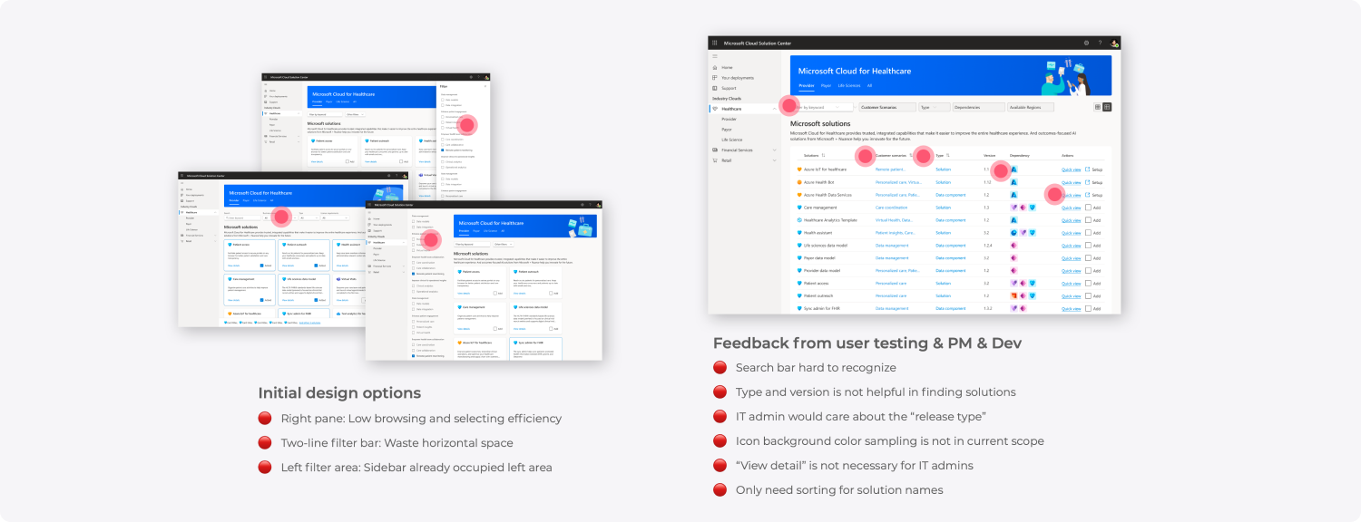
With feedback from internal developers, designers, and PMs, I finalized the design.
Deployment Variants
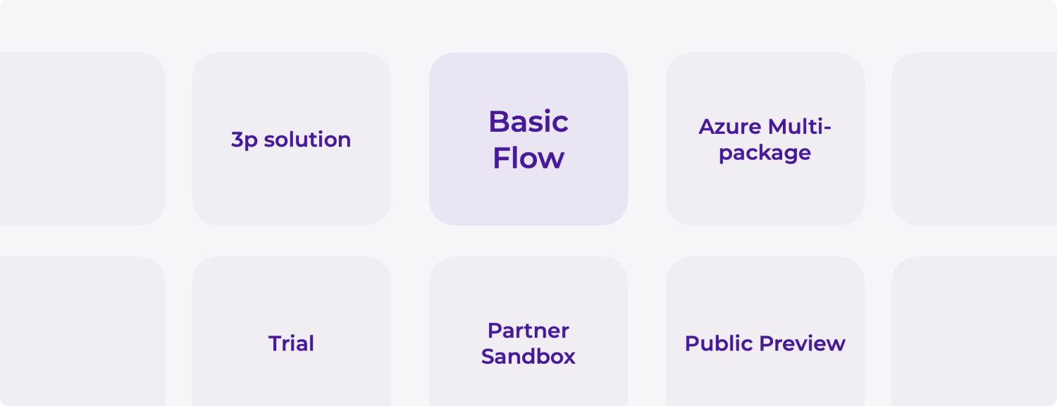
The deployment experience primarily consists of numerous wizards for users to configure solutions. The design aims to optimize user flows while addressing technical constraints.
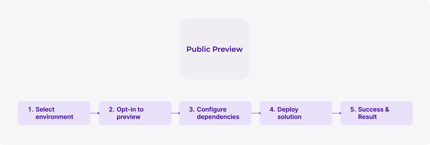
We already have a basic version of the wizard, but there are numerous variants for solution deployment. Therefore, my task is to customize the experience to support each version of the deployment wizard.
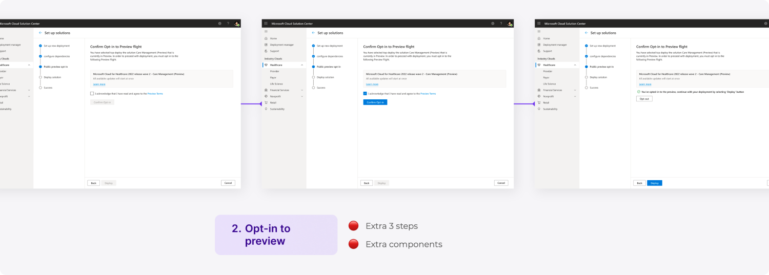
Take the public preview version, for instance. When I initially received the requirement from my PM, they wanted it to be a 5-step workflow. However, during the process of mocking up the designs, I discovered that Step 2 was causing an additional 3 actions for users and required extra components to design and implement. The developers were hesitant to combine steps according to my proposal as they were reluctant to invest more effort in changing the code base at that moment, even though it could bring long-term benefits. After discussing the legal implications of this task with my PM and UX writer, I brought it up to the dev director during the standup meeting. They agreed with my assessment, and the developer was finally assigned the task to support this change.


Deployment wizard in Solution Center is a complex and tech-based feature. Therefore, when designing these experiences, I typically create flow charts to map out the various cases. Additionally, I organize workshops with developers and PMs to clarify requirements and ensure we have addressed every edge case.
Moving forward with learnings
Solution Center is still a work in progress. The information architecture isn't yet perfect, and we're integrating more platforms while working with the dev team to set up the basic user behavior data collection pipeline. I maintain a design debt list so that whenever a new feature request arises, I can collaborate with PMs to bundle features and roll them out together, ensuring a continuously improving experience.
Throughout my work on Solution Center, I've learned valuable approaches for designing products to support different types of users. I've also gained insights into managing the design direction to achieve a cohesive experience that caters to both consumer-facing and enterprise-facing scopes. Through collaboration with stakeholders, I've learned to respect their goals and enhance my communication skills to effectively push the design forward as a unified team.
Design system & guidelines
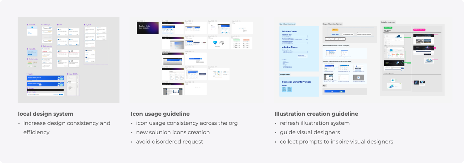
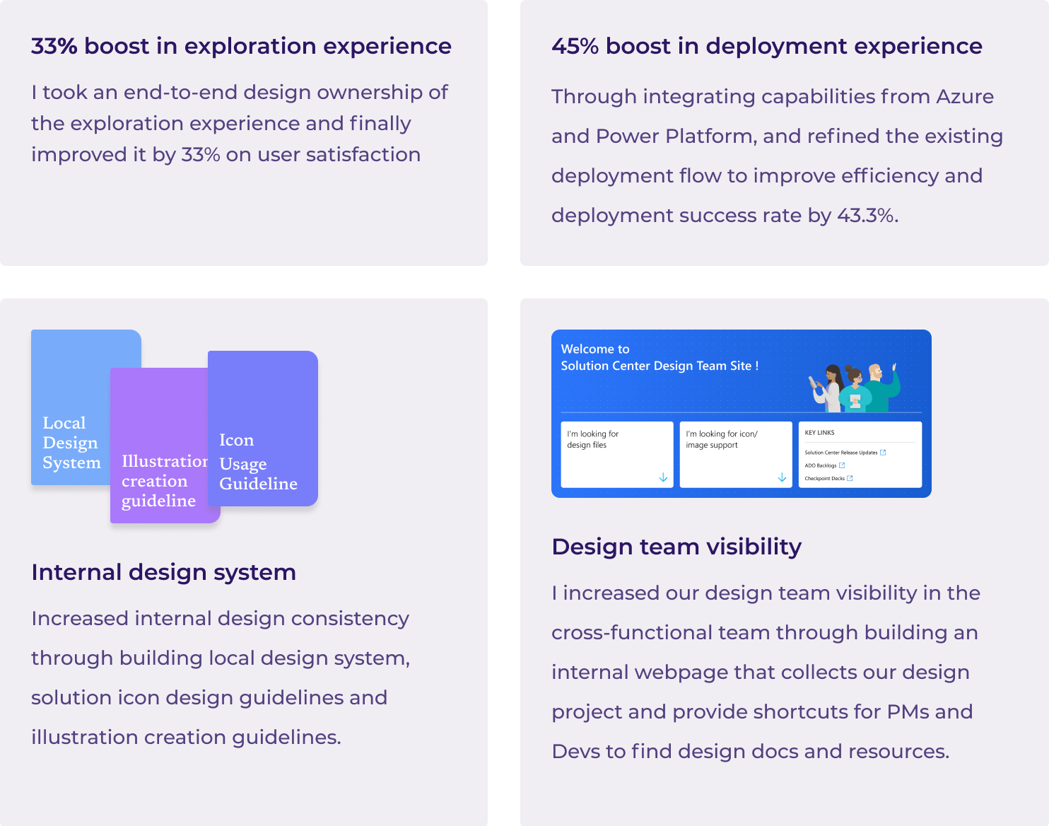
In addition to feature designs, I've collaborated with the visual designer in our organization to establish a virtual team dedicated to maintaining the design system and branding guidelines. I oversee the local design system for Solution Center and have also created guidelines for icon usage and illustration creation. These efforts have significantly improved internal communication efficiency and design consistency.

