Sponsor
T-Mobile Emerging Tech Team
Project Type
Group project with my classmates
Duration
6 month, 2020.06 - 2020.12
My Role
UX/UI Designer, Front-end Developer
Team Member
How Did We Collaborate?
Our Program, UW MSTI, is an interdisciplinary program, all of us has took user research courses. So we split the workload evenly at research phase. Then we divided into designer and developers at development phase.
01.OVERVIEW
Initial Problem from T-Mobile

So... What is IoT device certification?

What's T-Mobile's role?

T-Mobile, as a cellular network carrier, can provide several certification service. But their main task is to make sure that every device connected to their network are working appropriately, instead of behaviors like sending request to the network in an inefficient way. To achieve that, T-mobile's customers should obey the following certification process. Ideally, customers will provide T-Mobile with their test requirement, T-Mobile will conduct some pre-lab testing, so as to setup the lab devices. Then the customers and their devices will go through several rounds of test and debug. Eventually, the device will be released and enter into the final stage of maintenance.
How I'm plannig to seek solutions?
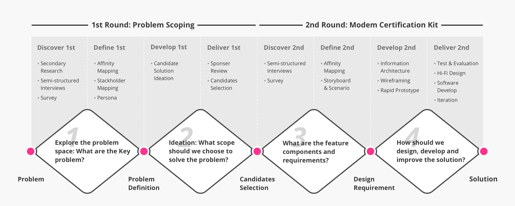
Since the problem we received is in a huge-scale and related with a existing complicated system, 2 rounds of double diamond process should be conducted. The first round of double diamond aims to figure out the direction of how to solve the problem. The second round of double diamond is the process we develop the solution following a more specific problem space.
02.OUR SOLUTION
A Self Service Device Certification Tool
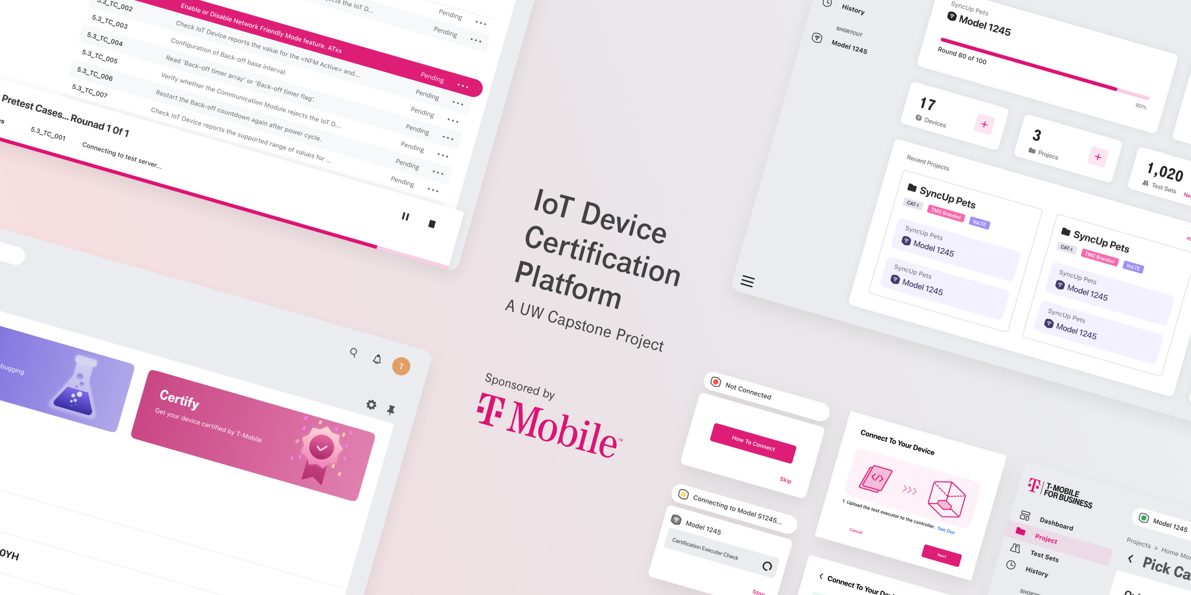
Our final solution is a self-service web application that helps IoT device developers test their devices by themselves. By this, we want to save the effort that developers and T-Mobile employees spent on preparing and going back and forth before developers sending their devices to T-Mobile Lab for formal testing.
Create Profile
Connect Device
Device Pretest
Test Report
02.EXPLORE THE PROBLEM SPACE
Initial Design Question

Research Question
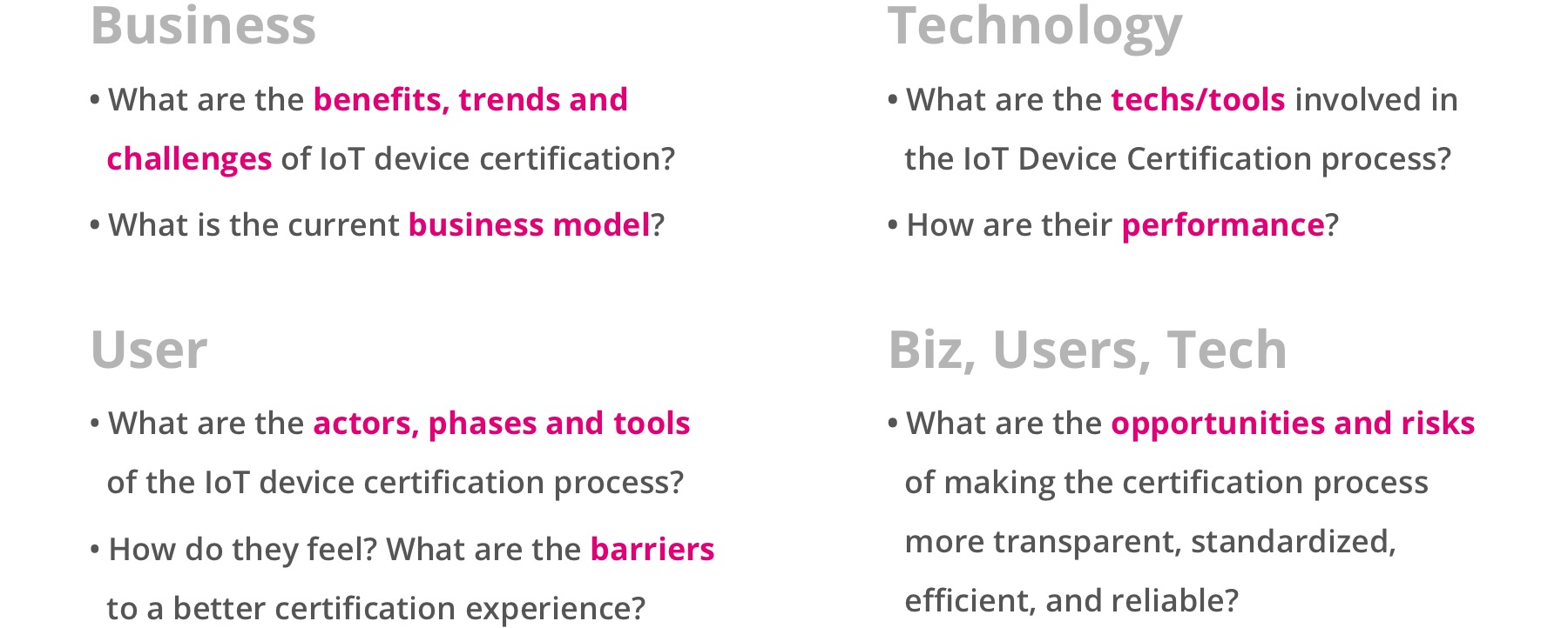
We derived some research question from our initial design question, to help lead the following research and bring all of us on the same page. These research questions stand for what we need and want to learn from the context and the audience.
Preview the Context | Secondary Research
To prepare our primary research with knowledges of the context, the market of IoT certification business, we started with secondary research. We studied relevant publications including industry reports, industry analysis, IoT standards and protocols,etc. And also we did competitor analysis to some similar or relevant products.
Findings and Assumptions
I listed some of our extracted findings and the assumptions that lead our primary focus.
Learn the audience | Primary Research
We conducted 1 hour semi-structured interview with experts and users from the industry, recruited from T-Mobile's connections, ours' personal connections and also from LinkedIn.
Data Synthesis
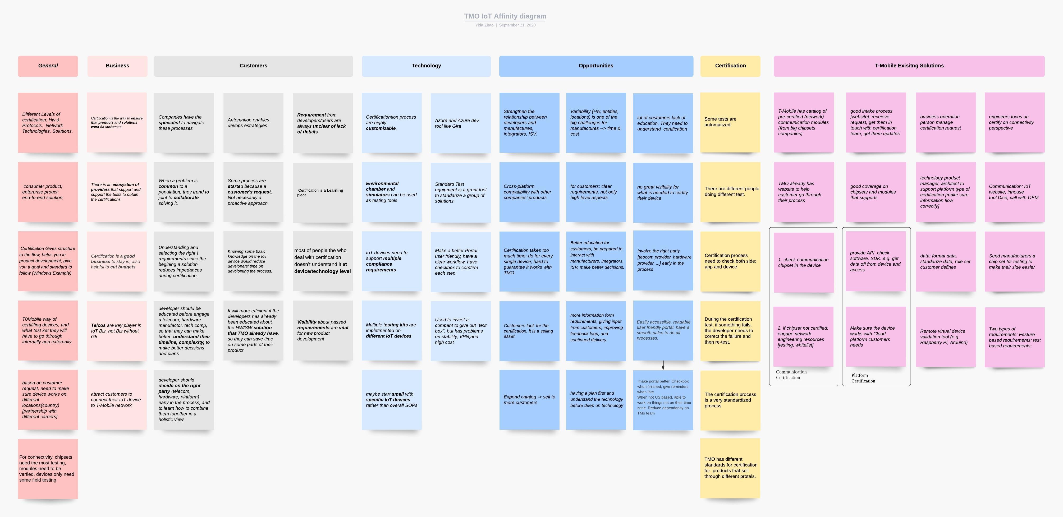
We gathered all the informations we gained from the primary and secondary research, extracted findings and insights to lead our upcoming brainstorm.
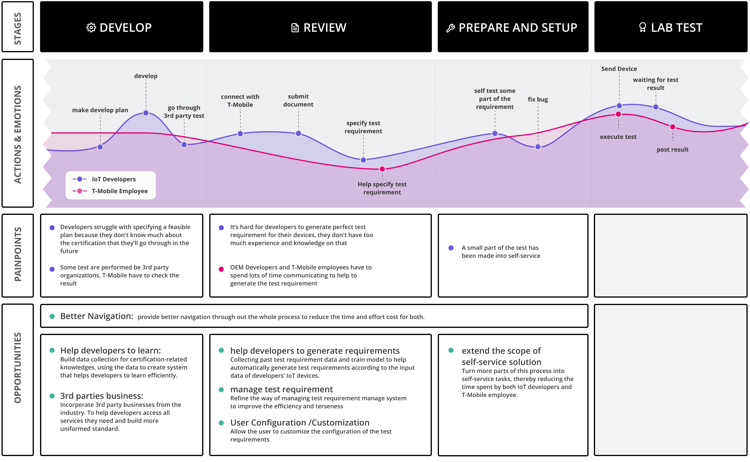
User Journey Map
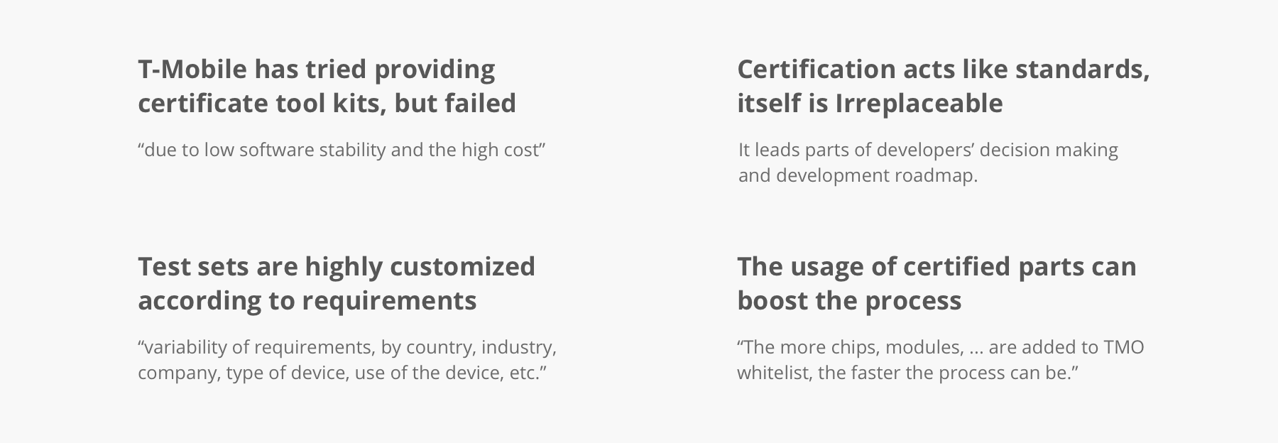
Key Factors
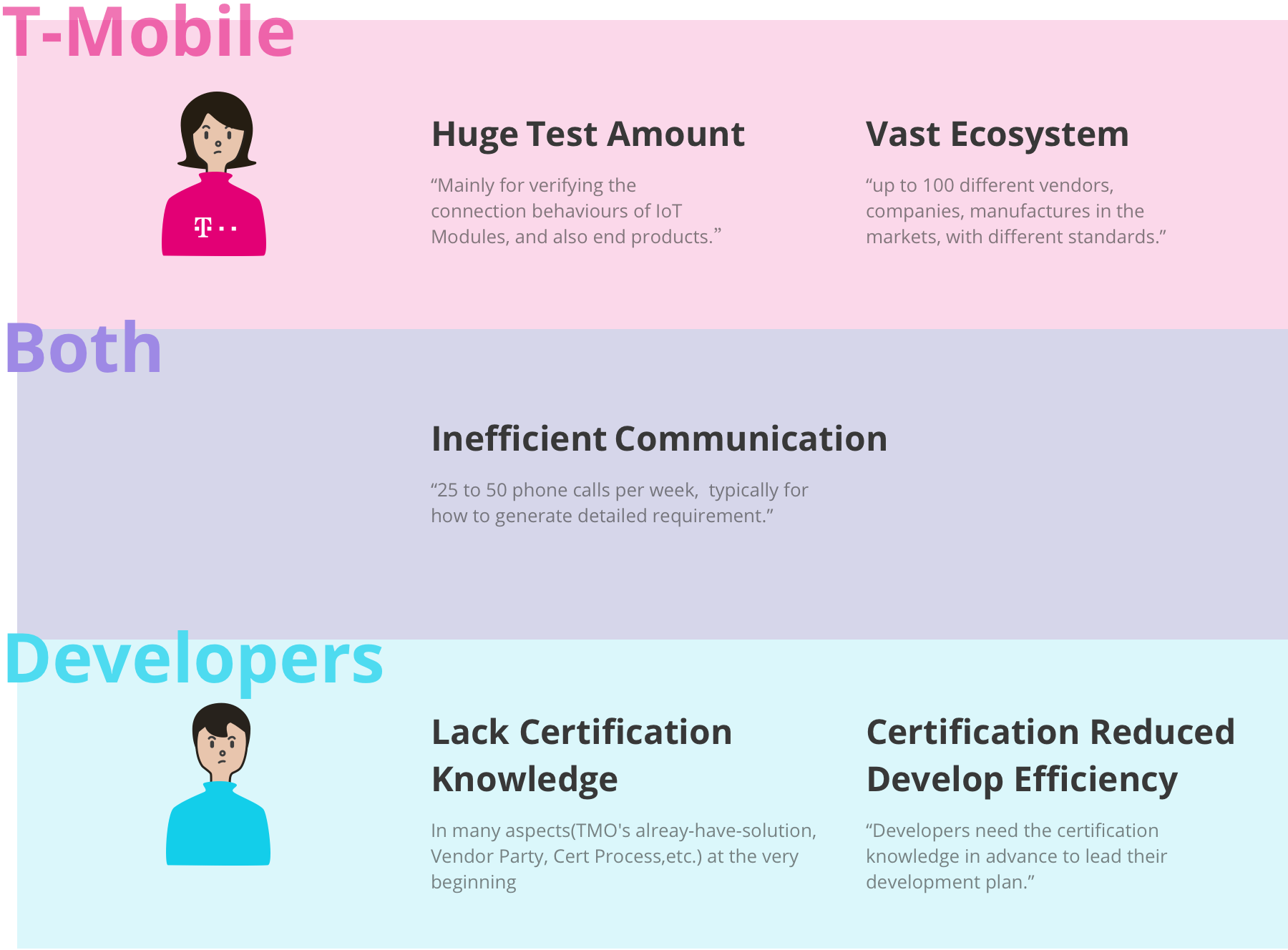
Stackholder Painpoints
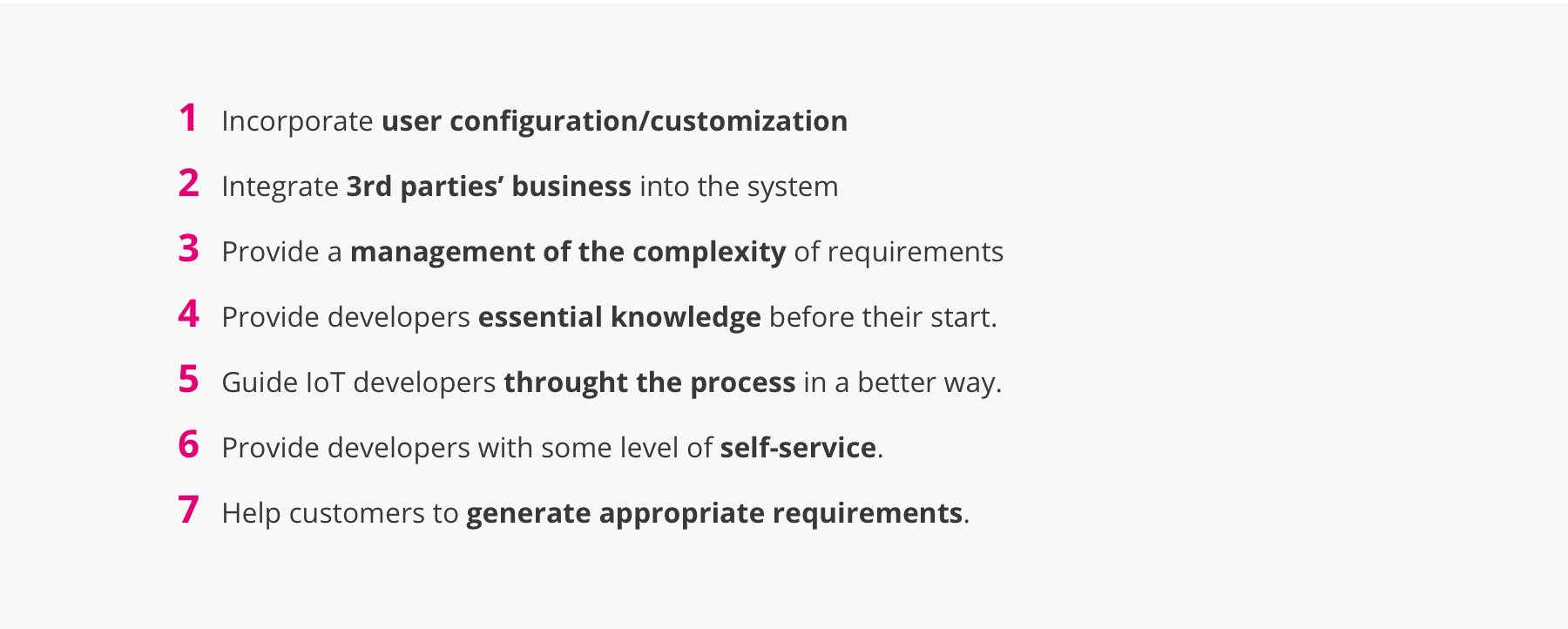
Design Directions
We draw 7 design directions to navigate us in the ideation phase. Each direction shows a potential way of improve our initial problem space.
04.NARROW DOWN THE SCOPE
Candidates Solution Ideation
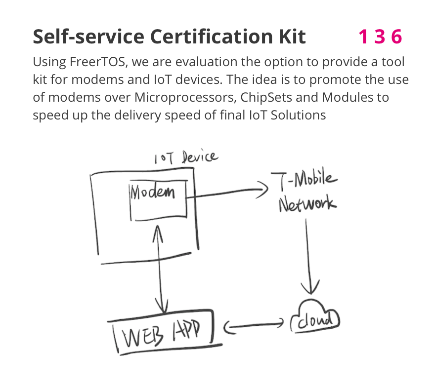
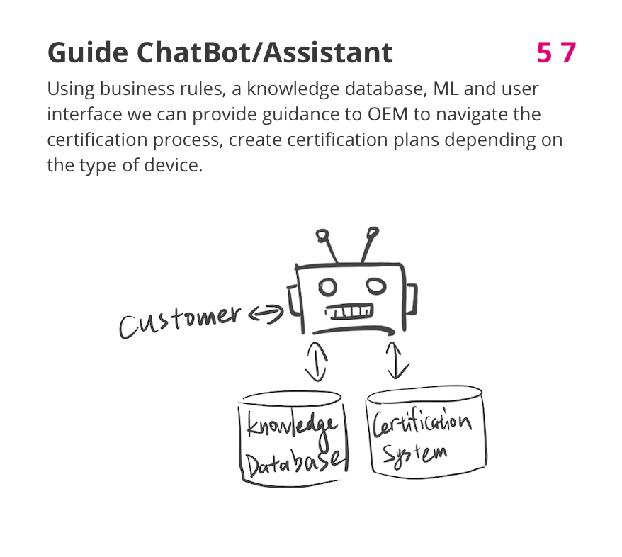
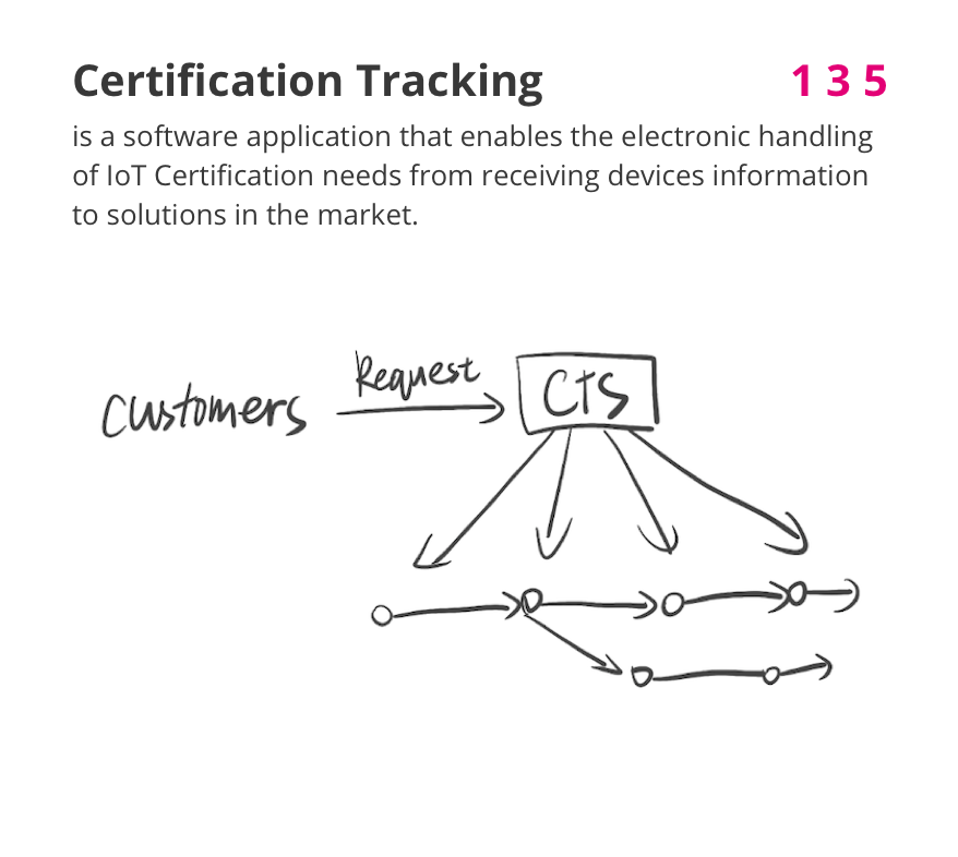
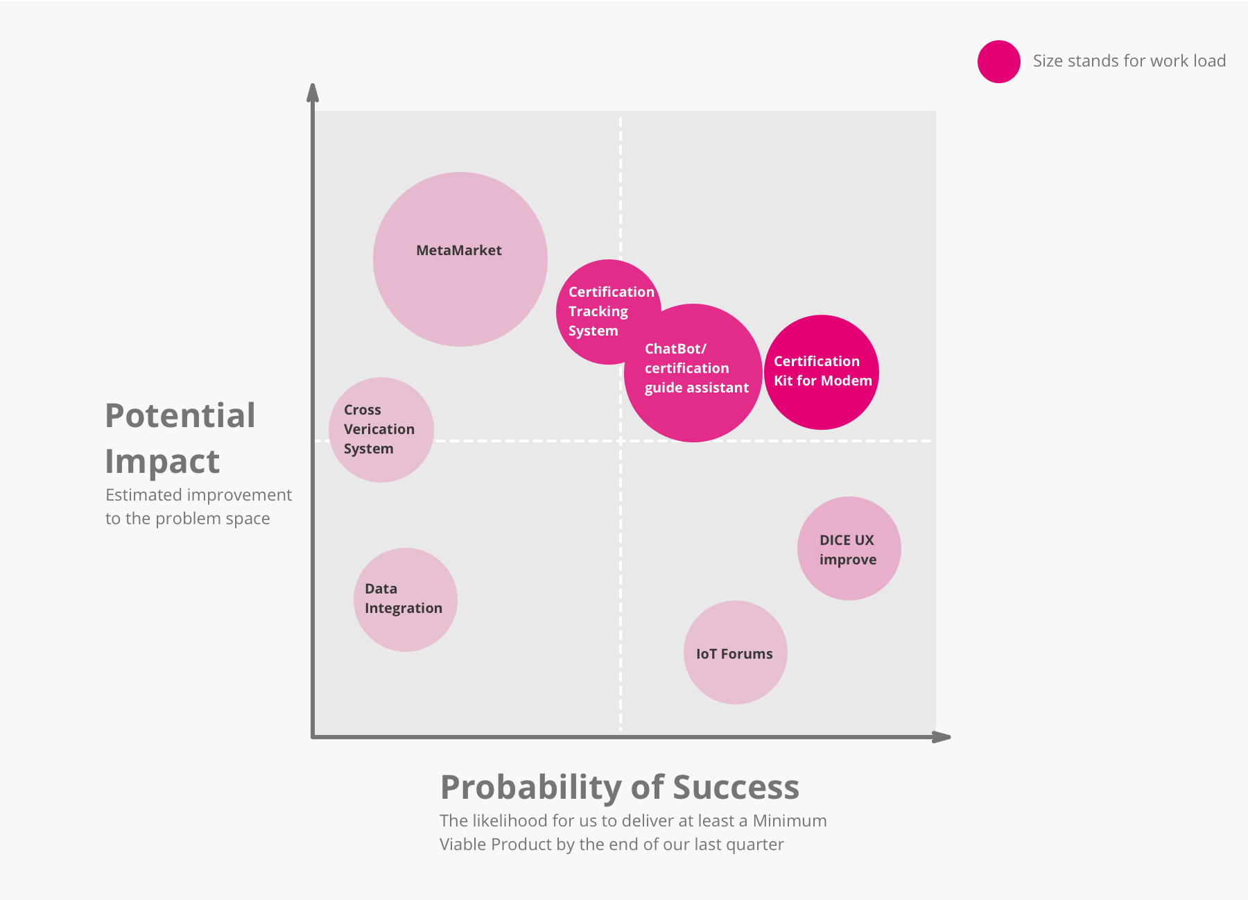
We had a brainstorm and generated several candidtes for the final solution. Since the problem space is huge and we are limited to the development time and resources, our solution will not cover all of the directions. Each of the candidate only combined some of the directions.
Candidates Evaluation
Refined Design Question

05.DESIGN ITERATIONS
Storyboard

UI Prototype Ver.1
Based on the features and tasks we decided to work on for the Minimum Viable Product. I made a low-fidelity prototype, containing the main tasks for users to test a device. Since developers test and debug repeatedly, I planed the final task for rerunning the failed test case.
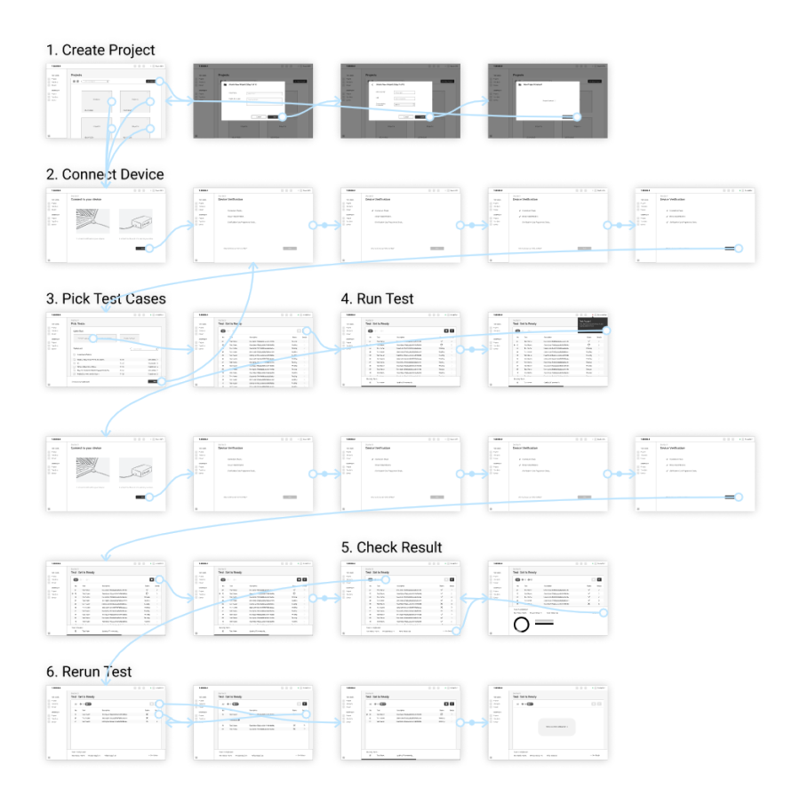
User Evaluation 1
It’s time to test the prototype! But we were not able to get connected with the users at this phase. To keep moving forward, we found some students with a technical background to act as our proxy users instead. Even though we can not check if our idea can really meet our users’ needs, we can check the usability of the interface from a general developers’ perspective.
Goal:Evaluate the usability of prototype 1 with proxy users.
Method:We set up 6 tasks and asked the proxy users to complete them with our prototype either by Zoom or in-person. The proxy users are told to think out loud so that we can record their feeling against the prototype. After that, we ask them to fill out a survey to rate their experience.
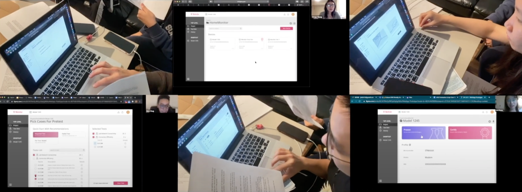
Outcomes:

Key Problems We Located:
Confusing Wording: Users are confused by the wording of some interactive elements they feel hard to predict the function of certain buttons or tab.
Information Defection: Users were not sure about the meaning of some content, they did not get enough information to help to make decisions.
Visual Implication Defection: Users did not realize that some elements are interactive
System Status Implication Defection: Some users are not sure about thesystem’s current status, and what actions should be taken next.
User Evaluation 2
I fixed the prototype according to the evaluation feedbacks and also some new ideas from our team. Then we are ready for the 2nd round of user evaluation. This time we finally got the real users from the industry and also some experts. Additional to the tasks we have, we also set up some interview questions to fulfill the information gap we still have.

Method:This time we use Zoom to talk with all the users and experts. The Med-Fi prototype is sent. An Semi-structured interview is connected after each walkthrough.
Outcomes:

I succeeded in improving all usability issues: we filled in the missing contexts, provided enough information. Users are clearly navigated and can quickly distinguish the UI elements. All users completed the tasks in a timely manner, occasionally with some minor hiccups, but in general, nothing was confusing to them.
The idea is trusted to solve the problem: Through we were not able to measure the real impact of the product at this moment. All of the users and experts coming from the IoT industry said they really saw the potential in this product.
Some supplementary suggestions and feedbacks: I was told that tests for devices can be required to be executed more than one time. And thus they need e-mail notification to inform them after the execution is done. Additionally, they mentioned Heisenbug, software bugs that seem to disappear or alter its behavior when one attempts to study it.
06.Final Display

06.DESIGN DECISIONS
Confused by the difference between the final display and the former versions? I can show more details on how I made each design decisions.
Information Architecture Change
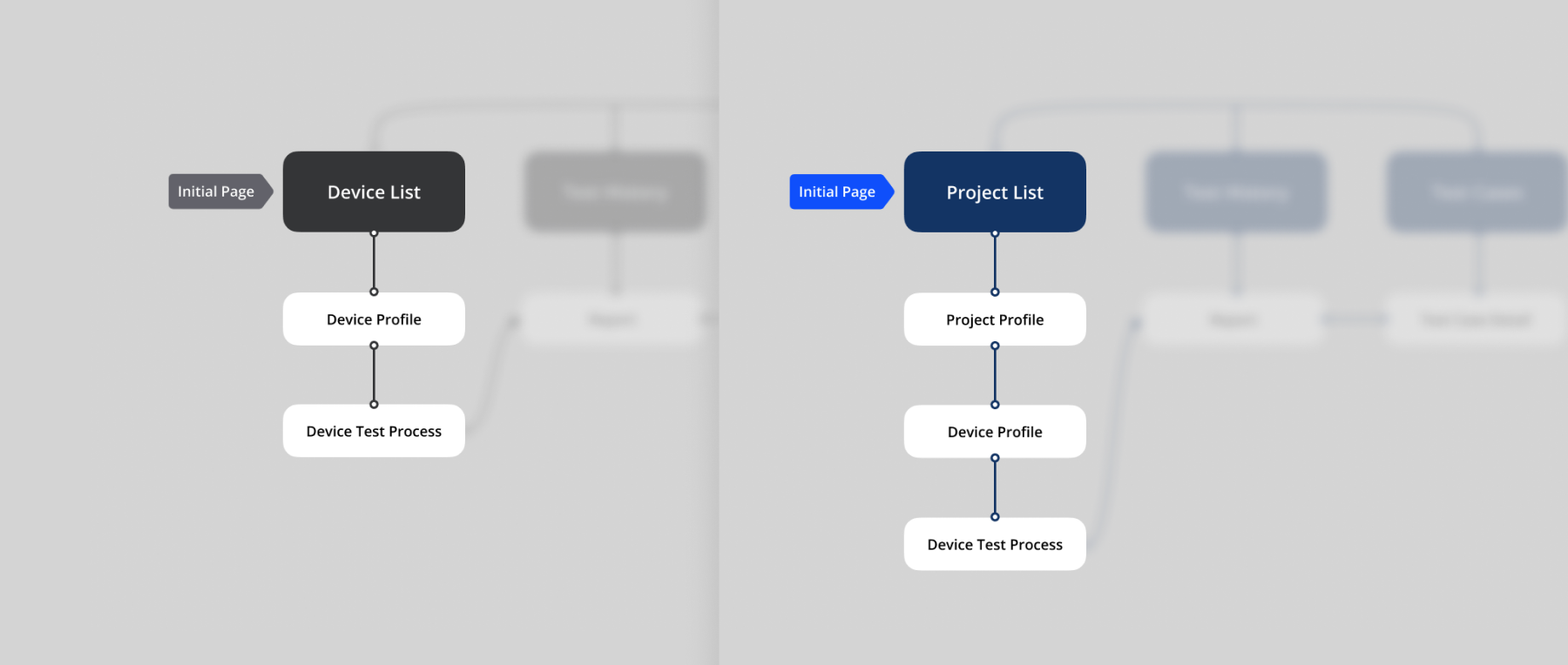
During the second round of user evaluation, our users pointed that our information architecture is different than the way they manage their projects. Before that, only a Device List page is presented before the testing process. But in real development, one project may have multiple models, each may contain different configurations. So that there should be another level higher than Device List, to contains multiple devices within projects. Then I added Project List ahead of Device List.
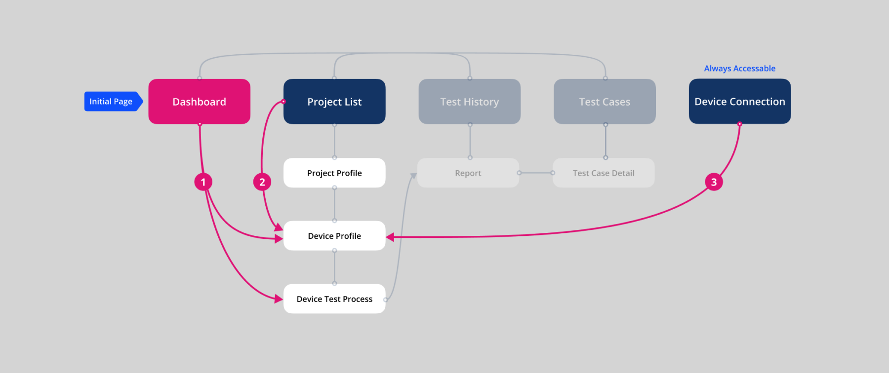
Since the hierarchy of this information architecture becomes deeper, it may impair the efficiency when the users want to go along to Test Process from the initial page. To counteract this negative effect, I brought in 3 ways of shortcutting the path:
- Adding a Dashboard connected to Device Profile or Test Process.
- Enhancing Project Card with entry point to Device Profile.
- Enhancing Device Status with entry point to to Device Profile
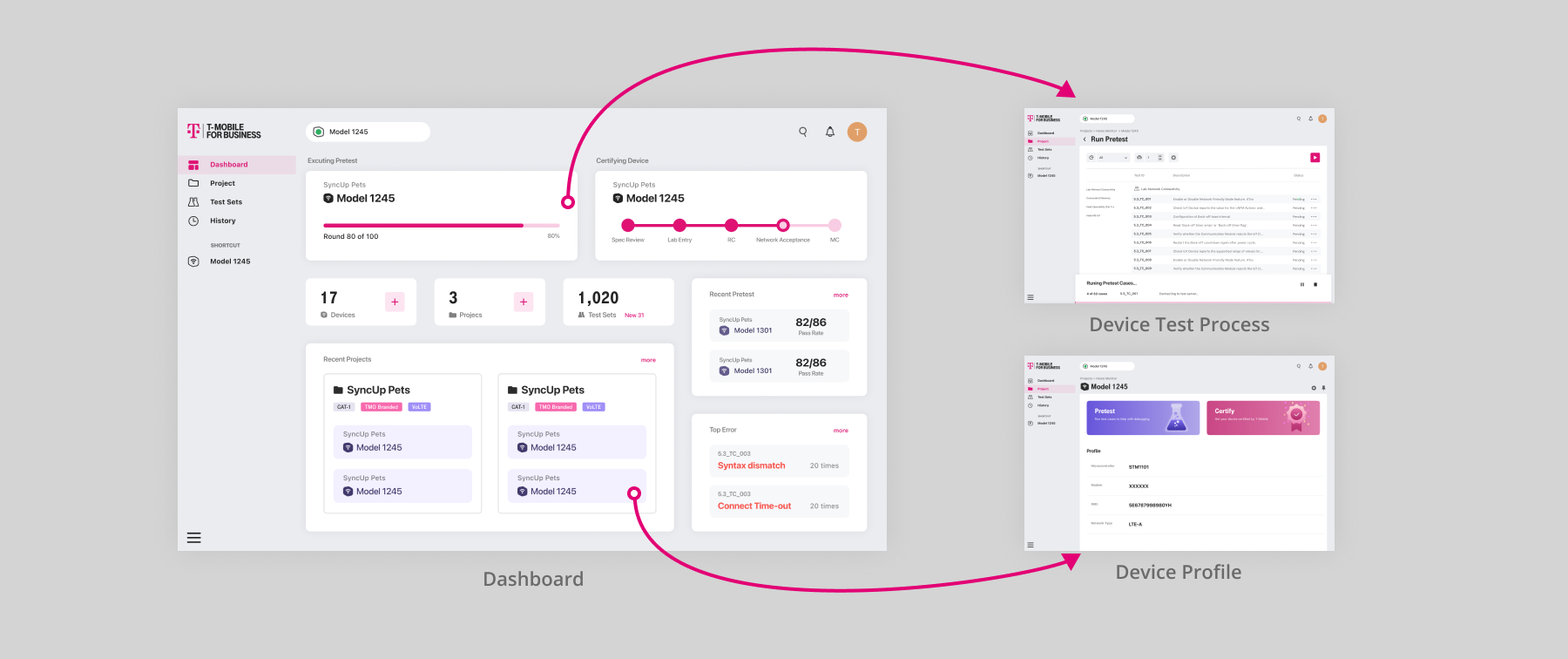
I change the initial page from Project List to a newly designed Dashboard. So that I can present brief data extracted from each part of the system. Including the recent accessed project or device, and the currently running test, through which our users can quickly jump to their target page once they are landed on the product.

Since users can check the status of connected devices on the navigation bar, I then enhanced the Connected Devices List with the entry point to the corresponding device profile page.
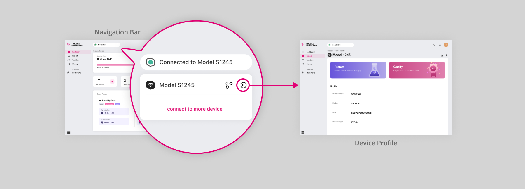
The project cards are enhanced to display some of the devices, sorted according to the recent access. So that the users can jump to their target device once they are landed on Project List.
Modality
Create Project and Connect Device are two self-contained tasks that can be presented apart from the main task flow since these two tasks have a clear start and end point. But the decisions I made on each of them differ.
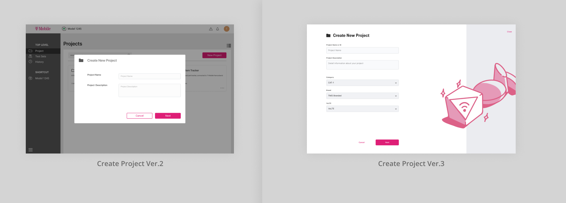
For Create Project, I choose popups-style in Version 1. But with the increasing of the required information, I realized that it's hard to maintain expandability for popups-style. Not to say the amount of required information should be much more bigger than it is now after launched in the future. In that case, a full-page-style modal view suits the need to input a bigger amount of information more. Besides, this task is called by the users, thus is less interruptive than Connect Device.
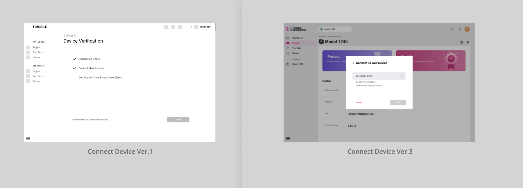
In version 1, I presented Connect Device with a full-page-style modal view, As a result during user evaluation 1, the users felt sudden when the view appears. They said they were not clear with what was going on. This was indeed caused by the defect in the wording, but another reason was the full-page-style modal view covered the main screen they focused on. I then changed this into popups-style. This Device Connect screen only appears when the user has not connected the device but wants to access the test console, which is interruptive. Popups-style can ensure that the users can feel where are they before being called to this interruptive task.
Technical Updates
Before this project, each one of us was not familiar with this field, we kept learning and exploring during the development. To help us exchange knowledge and opinions from various perspectives, we held 2 meetings every week. For my side, some design decisions are prompted by technical issues.
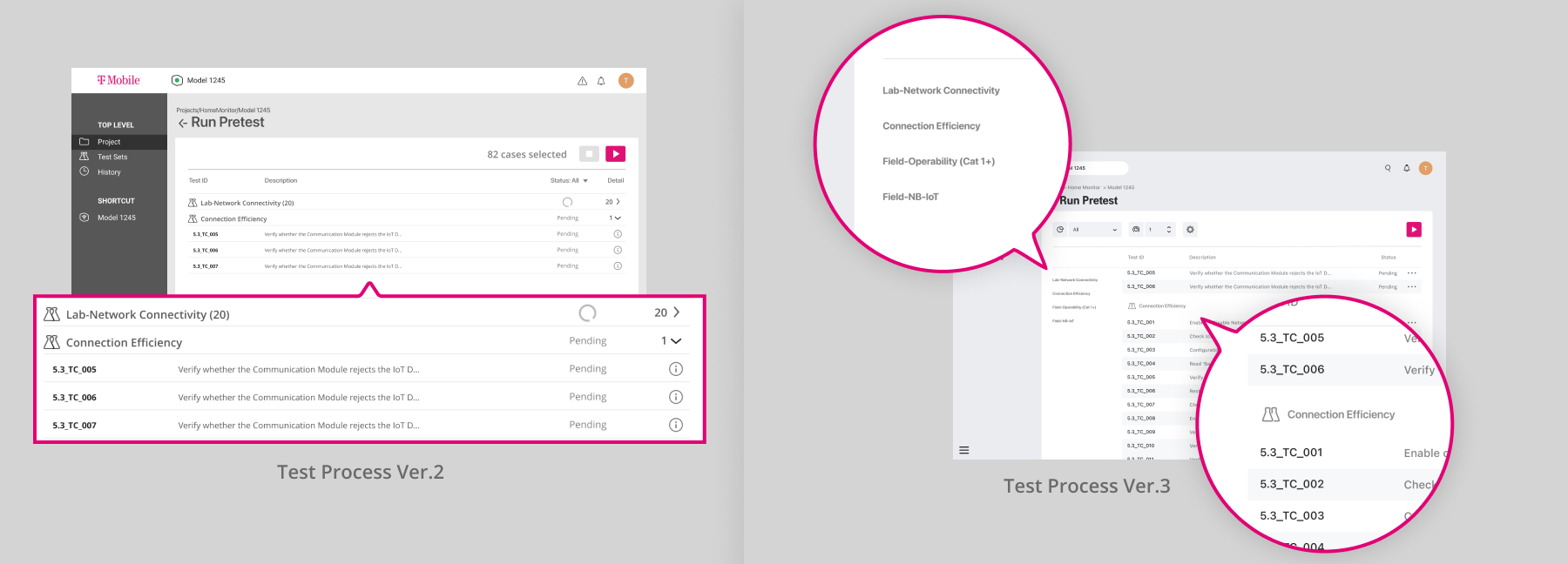
After finishing our first user evaluation, we received a technical specification file of the test cases we can implement for this project from T-Mobile. The data structures of these test cases are more complex than we thought. There were multiple categories of test cases and each one has different metadata. Before that, I just arrange the test cases one by one in Test Console and Test Select. To help users navigate through categories, I add a dropdown button beside each category title to help collapse a whole category, which I think can increase the efficiency when they want to scroll between categories. However, this design cause confusion when the test is running in Test Console. It is hard to summarize and describe all the status of the test cases under one category in one word or icon. And also the collapse/withdrawal animation can conflict with the animation of the Current Running Case Indicator. At last, I remove the collapse button. Instead, I add side navigation to trigger the list scroll to each category. This design sacrifice some horizontal space, but it worth.
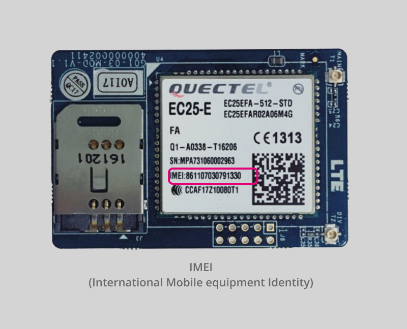
Our developers also found out that they can distinguish each device by its IMEI(International Mobile Equipment Identification). This ensures security when executing test cases on devices. The entrance to Device Profile in Connection Status I mentioned above also relies on the differentiation of IMEI. Thus I have to design an input function for IMEI.

IMEI is a string of numbers printed on the device. Each device may have one or two. It can also be read by a connected computer. Though it can be recorded in 2 ways, either one has its inapplicability. So I decide to enable 2 ways at the same time.
Motion and Visual
There are frequent status changes on the Test Console page, so I need to use animation to smoothen the gap between statuses. I started with the visual design of some key elements, before applying transitions to them.
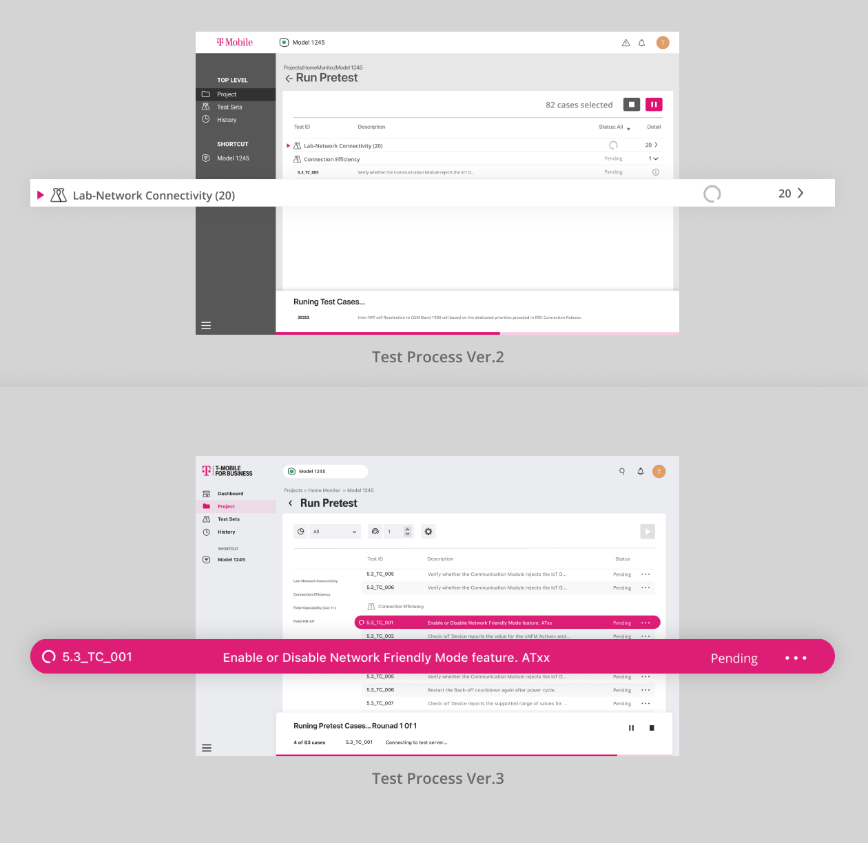
During user evaluation 2, some users thought the triangle was a button, only by clicking it can they start running the test case. I thought they would understand that this means the test case in this line is currently running because this design is inspired by some integrated development environment application and the proxy users are all software developers. But it turns out that this was not an appropriate solution, so I changed it in Version 3.
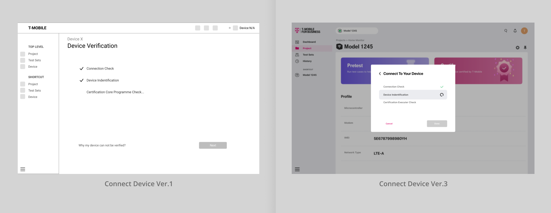
I also found that the status changes in Device Connection are similar to Test Console, so I changed its design into a similar style. Additionally, I think the process of connecting a device is a place to provide some positive feedback to users. So I add some color changes to make the whole process seems more enjoyable.
User Preference
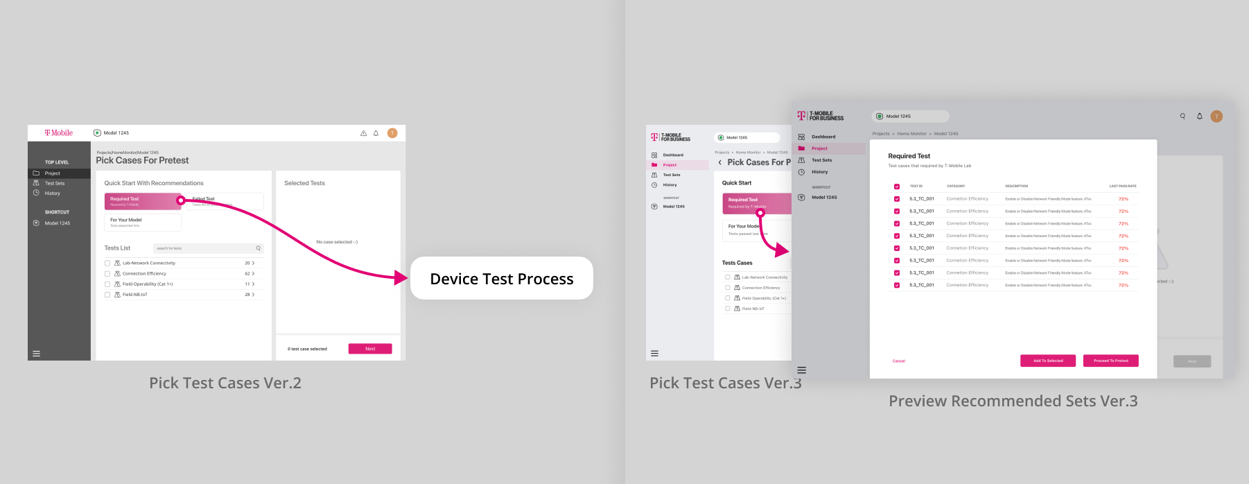
In user evaluation 1, our proxy users expect to preview the contents of each recommended test sets instead of instantly jumping to the test console after clicking. So I add a preview popup view. To cover the needs of customizing base on the recommended test sets or continue to the test console. I add a checkbox beside each case and CTA buttons for adding these cases to the list or testing them immediately.

In user evaluation 2, users and experts mentioned the needs to test the cases multiple times and receiving email notification when the test that cost a long time is done. So I came up with the idea of adding some ribbon on the top of the test sheet.
At first, I employed this text style Condition Setting Field, which I think could be clear on expressing the meaning of each condition. But actually, it is helpful only when the first time usage. This design may cause the waste of vertical space and distraction. Since the main user group are people who will use it frequently, I chose to consider more on their interest, instead of learnability. At last, I turned to icon-style, and also add hints to help new users.

